Contrast
I decided to enter a level design jam, hosted by Steve Lee. The theme was contrast. My submission was the first level of my VR FPS, Realm of the Fallen. I am a programmer who has been working on this game for over three years now. The team consists of myself and one artist (TheO). The engine is Unity which I have been using for a very long time. The levels are blocked out using Probuilder and most of the details/props are done by TheO in Blender. I am using Bakery GPU for lightmaps.
At this point the full game has eight levels, and one boss fight. A few months ago I showed some level designers the game and they pointed out some things that needed work. Lighting seemed to be their primary criticism. They noted that the lighting was not warm enough, and there was not enough contrast. Coincidentally this ended up being the theme of the level design jam.
Over the last few weeks I’ve made several changes to the game and this level in particular. There were a few issues I was trying to correct. Some were related to contrast.
Contrast of Texture Colors
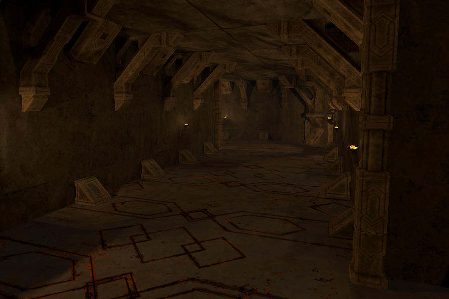
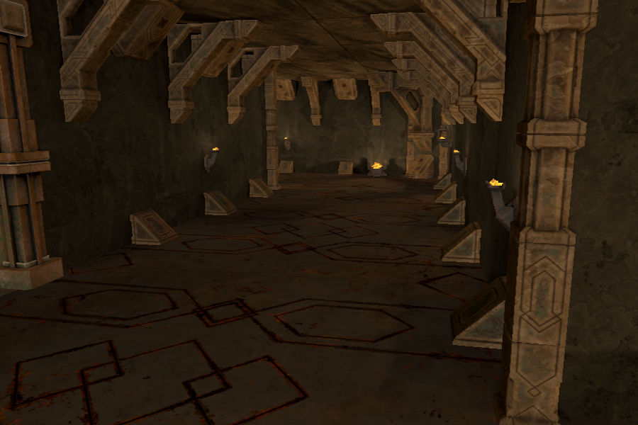
In the style of retro shooters, a lot of the environment was brown. This gets old after a while. So I decided to try to mix some gray walls in with the brown pillars (I made this decision after generating a few concepts using AI image generators).
Contrast of Light Colors
In addition to there being little variation in the texture colors, the light sources were all the same color. We devised some color combinations that would work, and created versions of the light sources for each of the new colors.
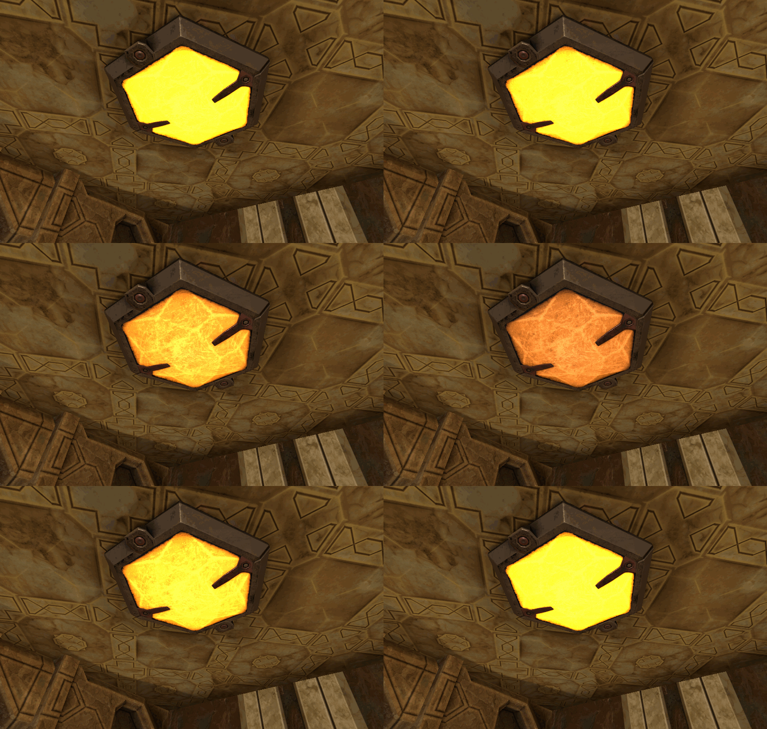
We also created a new type of light source that is flush with the walls. Originally all of the light sources were more ancient looking, but since the style of the game is not strictly fantasy we felt that it would be acceptable to have lights that look like magical ceiling lights. Personally, these are my favorite light sources in the game now.
Here are some light combinations TheO came up with. These were not baked and have the “old temple" aesthetic which is not to be found in the level that I entered into the jam.
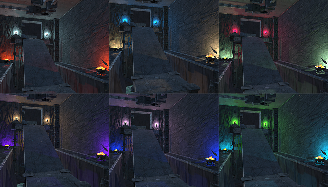
So far we have only used these color combinations in a few places.
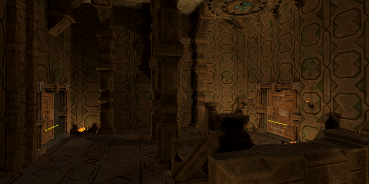
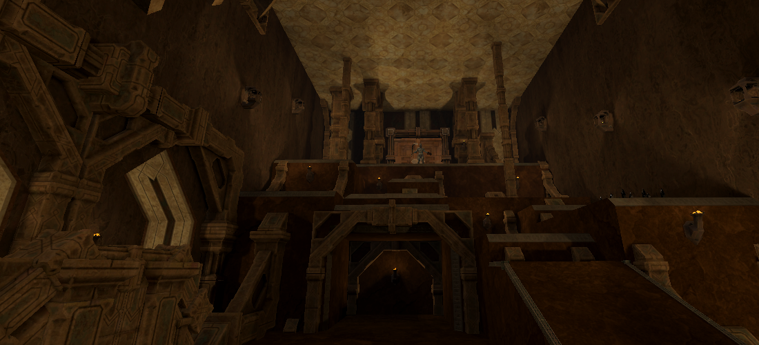
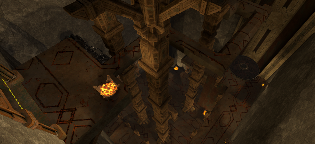
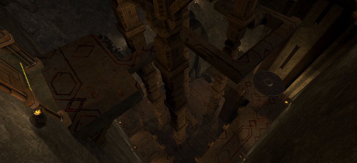
Contrast of Light Levels
The light levels were too uniform throughout the environment. Originally this was what I was going for because I was worried certain areas would be too dark. The game uses baked lighting with light probes. There are no realtime light sources except for one directional light that has a very low intensity (to show specular highlights on shiny objects). The reason for this is that the game is optimized to run on mobile VR hardware. So if an area is dark there is no way for the player to illuminate it. So previously I placed small light sources throughout the environments to ensure that everywhere was lit sufficiently. I had also increased the “indirect intensity” of the light sources. I felt this was a better alternative to brightening the ambient color.
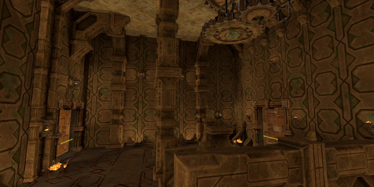
For some rooms, having uniform light levels looked fine, but the result of having each room be like this was quite boring. I decided that it would not be a problem if places the player did not have to go were dimly lit. I removed many light sources and moved the remaining ones so that they were clustered around the path the player is supposed to take through the level. I also turned down the indirect multiplier on the light sources.

Pulsating Lights
Previously the light source did not have any animation. I wrote a simple script to animate the emissive property of a material using a property block so that these surfaces look like pulsating lights. This effect worked better than expected and had no noticeable performance impact. Some of the environments feel much more alive. This effect worked especially well for the new “ceiling” light sources.
Players Getting Lost
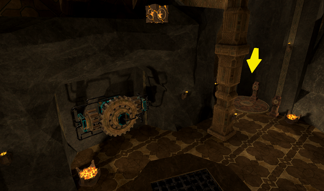
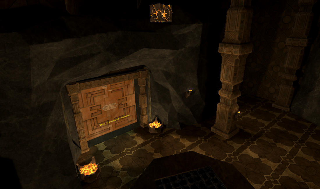
People couldn’t find the lift in the first room of the game. I made it so there was only one way to go, and I even tried putting a giant arrow pointing to the lift and during playtests I would still watch people miss it. I mitigated this by removing the elevator and making it so that the door to the next room is facing the player immediately when they enter. I added some light sources around the door to direct the player’s focus to the door, and I removed light sources from the sides of the room. The screenshots below show the room with the elevator and original lighting, and the room with the elevator removed and the newer lighting. One downside to this change is that the new lighting draws attention to the inconsistency between the style of the rock surfaces and the rest of the geometry in the game.
Temple Exterior
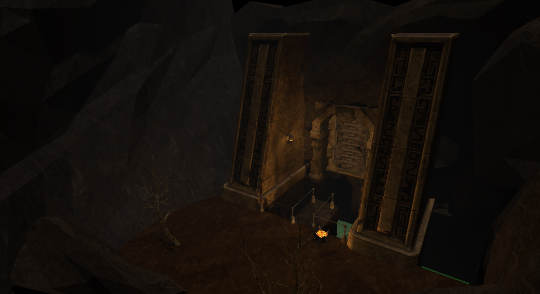
The game takes place in an ancient temple. The player starts outside of the temple and walks in. I liked the idea of having the player start outside of the temple so that there could be both outdoor and indoor areas in the same level. For a long time I had placeholder art for the outside of the temple. A while back TheO made a detailed temple exterior, but the geometry intersected the rooms so I deferred putting it in the game until now. We finally modified the interior of the temple to fit with the facade. Below you can see the original placeholder exterior, and then the new improved one.

Fun Unnecessary Stuff
The player spawns outside of the gates and walks into the temple. If they turn around and head back toward the water, a serpent rises from the sea and eats them. This is partially to cover up the fact that I have not implemented swimming, but mostly just because I thought it was cool. This is the serpent.

The player does not die if they are eaten by the serpent. That would be too punishing given that the load times are not instantaneous. Instead the player is placed back at the spawn point. During playtests I have noticed a few players trying to attack the serpent (you can’t kill it). I’ll have to keep watching people play and see if this is an issue. Some have suggested that the serpent should be a boss.
What’s Next?
Over the last few weeks we identified a number of factors in the game’s environments related to contrast that could use improvement. None of the levels are 100% polished. We still need to do another pass over each level and update the lighting/textures. Even this first level has some barren places and other areas that obviously need improvement.
How to Play
If you are interested in playing the game, it is currently available for the Meta Quest 2. A free demo is available on Itch.io and SideQuest that includes the level that was submitted to the level design jam. See https://realmofthefallen.com .
Files
Realm of the Fallen
Virtual reality FPS game.
| Status | In development |
| Author | Virtual Destructor |
| Genre | Action, Shooter |
| Tags | FPS, Oculus Quest, Singleplayer, Virtual Reality (VR) |
More posts
- Realm of the Fallen is now available on Steam!Dec 04, 2023
- Dev Log: Genre Shift, Level Design Progress, and Upcoming EnhancementsApr 14, 2023
- Testing TweaksDec 15, 2022
- Faster-paced Gameplay, Endless Wave Mode Coming SoonDec 15, 2022
- Save Files, Applab ReleaseNov 09, 2022
- Enemies With Guns, Melee Improvements, Machines, PCVROct 22, 2022
- Development update: Story In Game, OptimizationSep 15, 2022
- Updated Demo ReleasedAug 27, 2022
- Updated Demo/Early Access Release SoonAug 23, 2022
Leave a comment
Log in with itch.io to leave a comment.